Internal User Portal Made Simple
A internal portal for Subaru's users so they can extract and review reports.
CLIENT
Subaru
TIMELINE
4 Months
INDUSTRY
Automotive
ROLE
Lead UX/UI Designer

Ansira’s new owner Truelink wants to refresh their website with a new and innovative experience. They complained that their current site felt outdated and didn't speak to their brand identity.
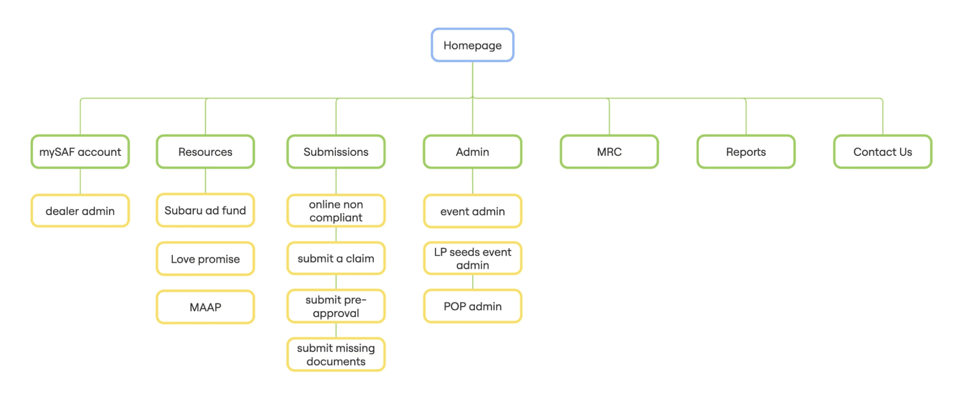
Subaru's portal is extremely outdated and lacks a clear flow for users to grab reports and data. The portal has not been updated since 2006, so it requires a major redesign and thorough research to understand new pain points. The portal has also not been translated to mobile, so that was a critical note that we kept as a top priority.
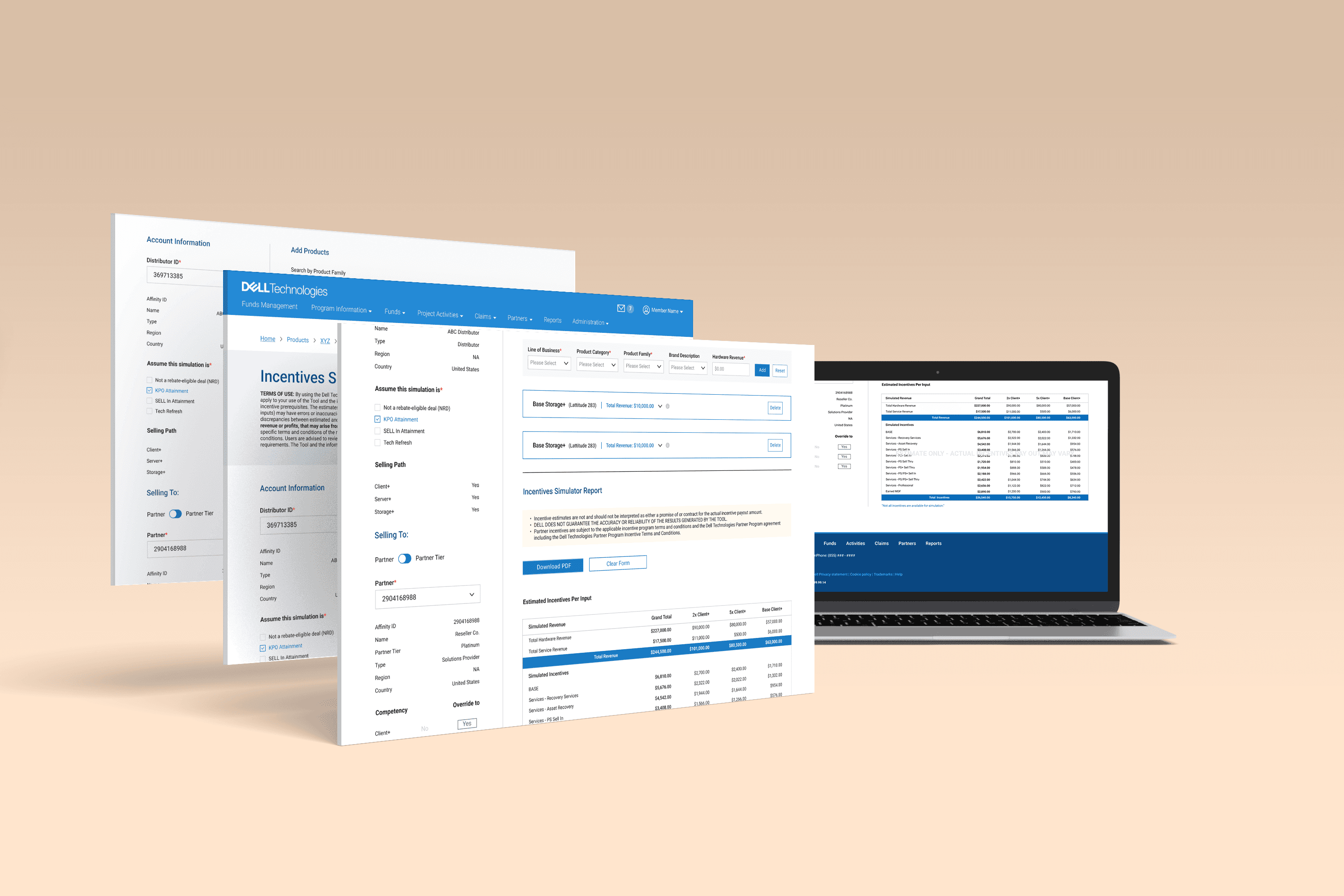
How might we create an incentives simulator so that users can efficiently create and submit incentives, and export data without any blockers?
Working alongside the user researcher, she conducted empathy maps and moderated testing to understand the types of users. We found out there are 3 types: corporate user, retailer, and zone manager.
With the empathy maps and user testing, we uncovered various details such as their likes and dislikes of the current portal. Because this platform is essential to many subaru user's job, we wanted to make sure we captured all thoughts and feelings associated with the current portal.

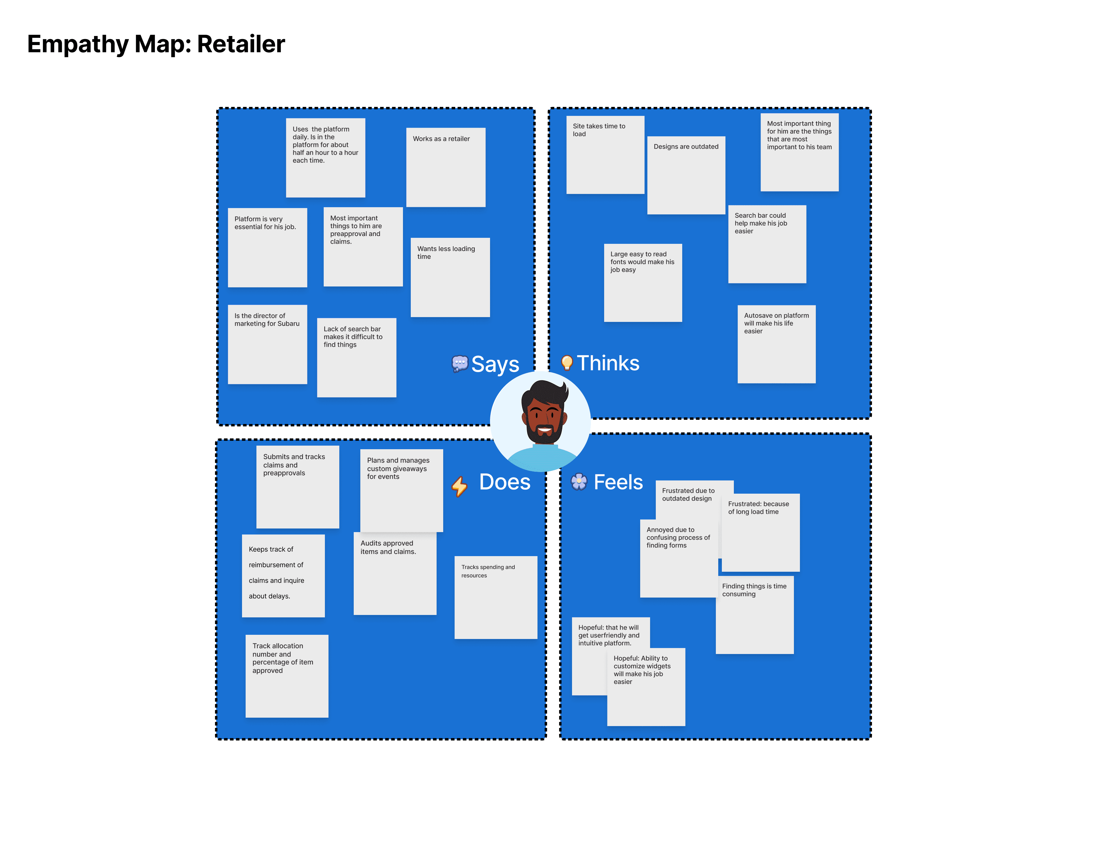


I worked alongside a researcher to uncover pain points so we could understand any underlying issues. We covered 3 major pain points that we wanted to make a priority. Next, I made note of the pain points and took those into consideration for wireframing.
We created a diagram of the experience for setting your location and planning a visit. This helped give us insight into how users approach the website and plan a visit to go in person.


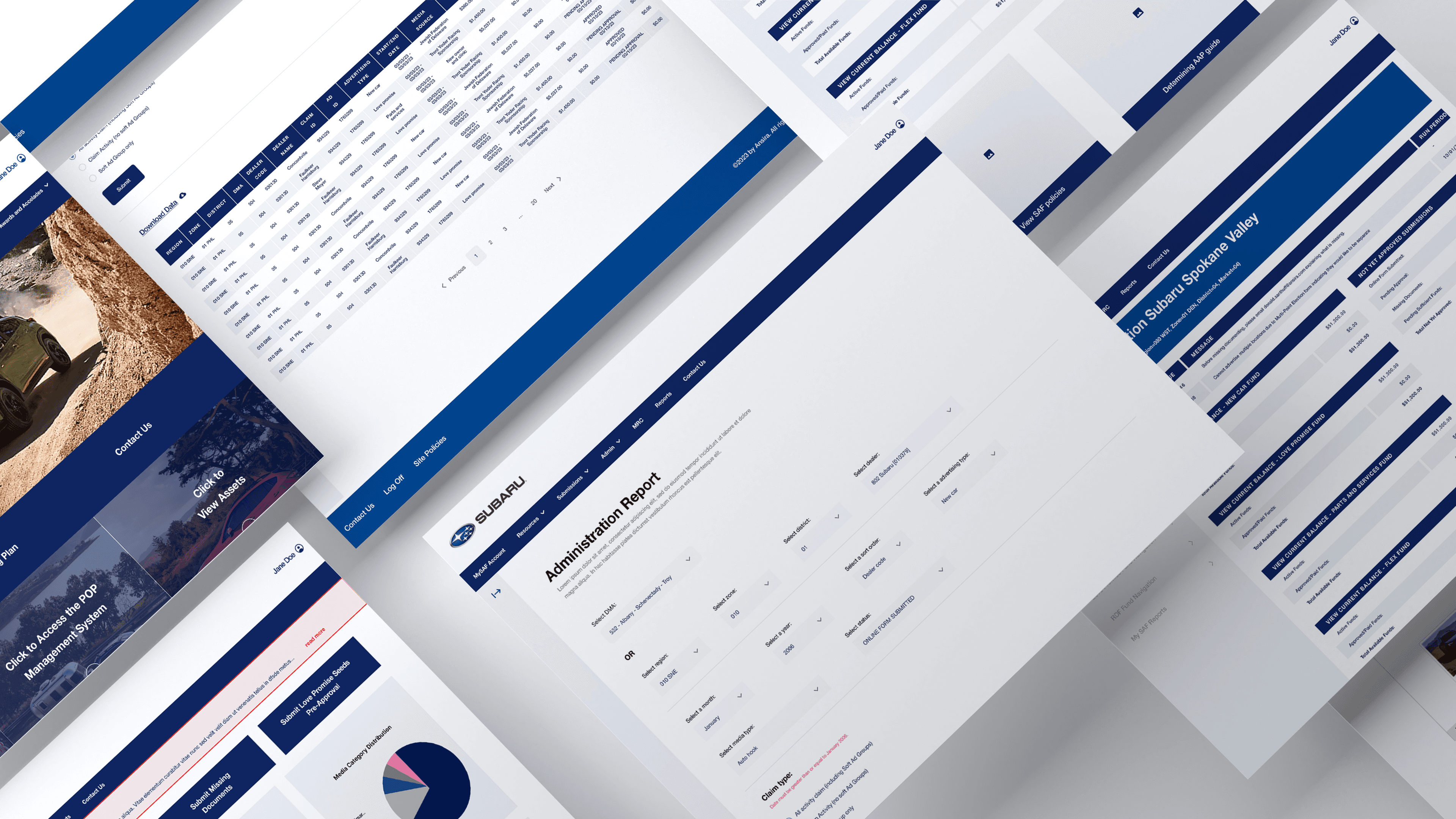
I re-designed how reports would look like to match the consistent simple and modern feel of the website. This allows users to understand the data efficiently since it is easier to read for the users eyes. I made sure to color coordinate data points and focus on input fields to organize required information needed to pull reports.


MRC is an external part of the subaru website that would lead users to a different page in a new tab. This marketing resource center is a pivotal part of Subaru's portal so I wanted to capture the same theme of modern and simple designs to bring forward Subaru's identity. We focused on leveraging hover states and gradients to bring depth into the imagery and content on the website.


Overall, I learned a lot about working with a creative designer to translate the designs into high-fidelity and development to push it live. This was my first time working on a project with limited time for research, but nonetheless I uncovered great pain points to solve, making the design smooth and effortless.
Overall, I learned a lot about working with a creative designer to translate the designs into high-fidelity and development to push it live. This was my first time working on a project with limited time for research, but nonetheless I uncovered great pain points to solve, making the design smooth and effortless.